How to Run a Pareto Chart in Minitab
One of the most useful charts to visually represent where areas of concern in a business may be is the Pareto Chart. The chart identifies the Pareto principle, or what many call the "law of the vital few," or more often, the "80:20 rule." The principle suggests that most effects come from a small amount of causes. By creating the Pareto chart, areas of concern are easily identifiable.
Steps to Running a Pareto Chart in Minitab
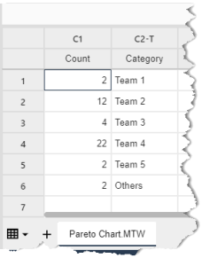
Below are step-by-step instructions on how to run a Pareto chart in Minitab. The data used in the following example can be downloaded in .MTW format Pareto Chart.MTW. It shows the count of defects across five different teams.
-
- Download and open the Pareto Chart.MTW data file.

- Click on Stat → Quality Tools → Pareto Chart.

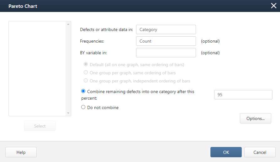
- A new window with the title "Pareto Chart" pops up.
- Select "Category" into the "Defects or attribute data in" box
Select "Count" into the box "Frequency in."

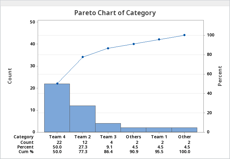
- Click "OK." The Pareto Chart will open in a new window.

- Download and open the Pareto Chart.MTW data file.
Interpreting the Pareto Chart in Minitab
It's important to know how to create a Pareto chart, but understanding what the chart is showing and being able to communicate that among team members is what makes this chart useful.
The purpose of running a Pareto analysis on this data set was to find how many defective products were being created by each team. In this example, your effects are the defects, and the causes are the teams. The chart created by Minitab has sorted the teams in descending order by the number of defects created. Team 4 was placed on the left with 25 of the 50 total defects. The percent under the count of defects shows what percentage of the total defects the team was accountable for. The connected data points above the bars represent cumulatively what each team contributes as a percentage to the total number of defects. The graph shows that about 80% of the effects come from 20% of the causes.
Now that the graph has been interpreted, the next step would be to continue analyzing the data to identify what is causing the effects in the 20%. A second and third-level Pareto chart should be created to identify the root cause for defects among the team.
Join Our Community
Instant access to hundreds of "How to" articles, Tools, Templates, Roadmaps, Data-Files.. Everything Lean Six Sigma! Come on in! Welcome to our community of Lean Six Sigma certified professionals.


This won’t work at all if the numbers are formatted as text. Wasted an hour trying to figure out why my graph didn’t look like this one.
Hi Cesar
You’re Correct
Minitab indicates if it considers a column as text by including a -T in the column heading.
I dont want to combine categories and I dont want an Other column. How do I get all of the pareto tail visible on the graph so the numbers are not squished ?
Hi Joe,

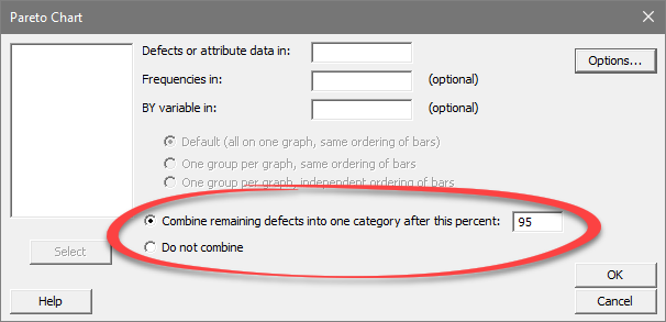
Thanks for the question. In Minitab when running a Pareto chart you can elect to either “not combine” or combine after a certain percentage. The default is to combine after 95%. If you select “Do not combine” there should not be an “other” category unless you have a category in your data labeled “other”.