

Box Plot with Minitab
What is a Box Plot with Minitab?
A box plot in Minitab is a graphical method for summarizing a data set by visualizing the minimum, 25th percentile, median, 75th percentile, maximum, and potential outliers. A percentile is the value below which a certain percentage of data fall. For example, if 75% of the observations in a data set are less than 685, then 685 is the 75th percentile of the data. At the 50th percentile (median), 50% of values are lower, and 50% are higher.
Box Plot Anatomy
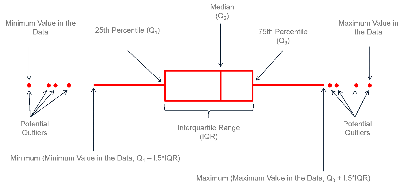 The figure above describes how to read a box plot. Here are a few explanations that may help. The middle part of the plot, or the “interquartile range,” represents the middle quartiles (or the 75th minus the 25th percentile). The line near the middle of the box represents the median (or middle value of the data set). The whiskers on either side of the IQR represent the lowest and highest quartiles of the data. The ends of the whiskers represent the minimum and maximum of the data, and the individual dots beyond the whiskers represent outliers in the dataset.
How to Use Minitab to Generate a Box Plot
Data File: Box Plot tab in Sample Data.xlsx
Steps to render a box plot in Minitab:
- Click Graph → Boxplot.
- A new window named “Boxplots” pops up.
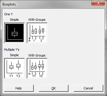
- Click “OK” in the window “Boxplots.”
- Another new window named “Boxplot– One Y, Simple” pops up.
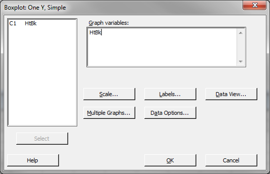
- Select “HtBk” as the “Graph Variables.”
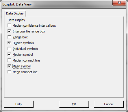
- Click the “Data View” button, and a new window named “Boxplot– Data View” pops up.
- Check the boxes “Median” and “Mean.”
- Click “OK” in the window “Boxplot– Data View.”
- Click “OK” in the window “Boxplot– One Y, Simple.”
- The box plot appears automatically in the new window.
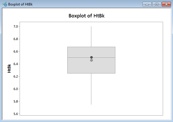
Model summary: The figure above shows the boxplot obtained by navigating the Minitab menus. Notice the interquartile range between the 25th and 75th quartiles, the median line, the mean, and the whiskers.
About Lean Sigma Corporation
Lean Sigma Corporation is an independent Six Sigma certification authority responsible for the development, administration, and governance of professional Six Sigma credentials. The organization defines certification frameworks, examination standards, and credentialing systems to evaluate and recognize Six Sigma competence across professional training environments.
Organizations and instructors delivering Six Sigma training in accordance with these recognized standards participate in Lean Sigma Corporation's Authorized Training Partner (ATP) Program.